A New Take on Tracking Test Results
In our years of experience building TestMonitor, one element stood out from the rest in being the most difficult to design, the hardest to optimize, and the biggest challenge to keep simple: tracking test results. There is a simple explanation for that. When tracking results, everything that has been defined, designed, planned, and executed up till now has to come together. The challenge: placing requirements, test cases, test runs, and the test results themselves, in a single screen, merely 1920 pixels wide and 1080 pixels high.
With simplicity as our guiding principle, designing a screen with all these criteria has become nearly impossible. Two years ago, we made a huge step in striking the right balance between a simple interface and still presenting all relevant information. In the last couple of months we improved that design and want to share our latest take on test result tracking.
The origin story
Two years ago, we revamped test result tracking by the use of two perspectives: a test case-based and test run-based view. Each view shows a list of test cases and test runs respectively, along with their progress and latest outcome (which refers to the latest, most severe test result). That ended up looking like the screen you probably have become familiar with: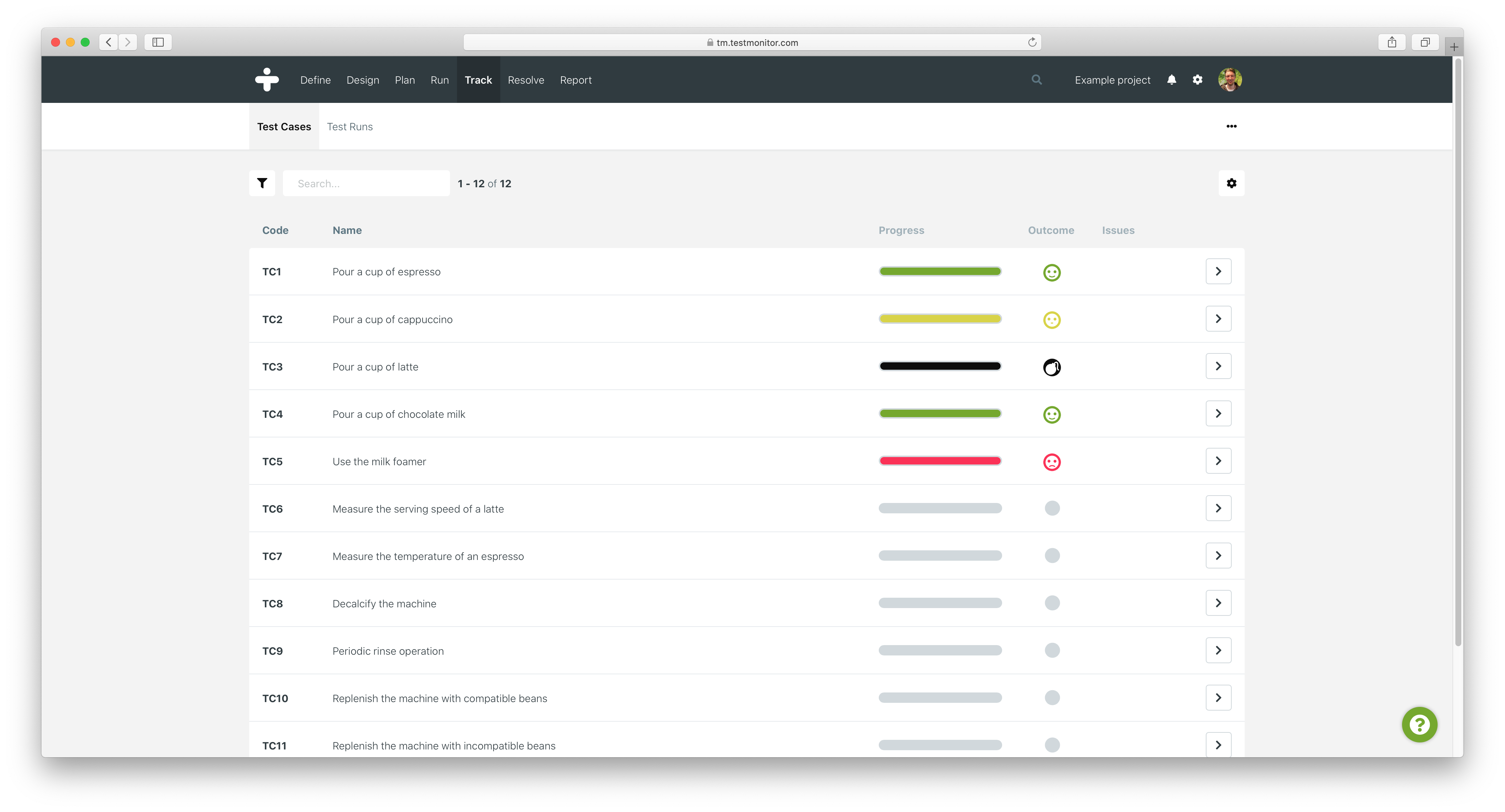
For both perspectives, we wanted to offer a quick peek at the actual test results. Test results are represented by a result finding (or smiley), description, and file attachments.
Whenever we want to display the context for a specific object in TestMonitor, such as a test case or a test run, we use a sidebar. For both consistency and convenience, we decided to use this sidebar for the "test result quick peek" as well. With the sidebar opened, it looked something like this:
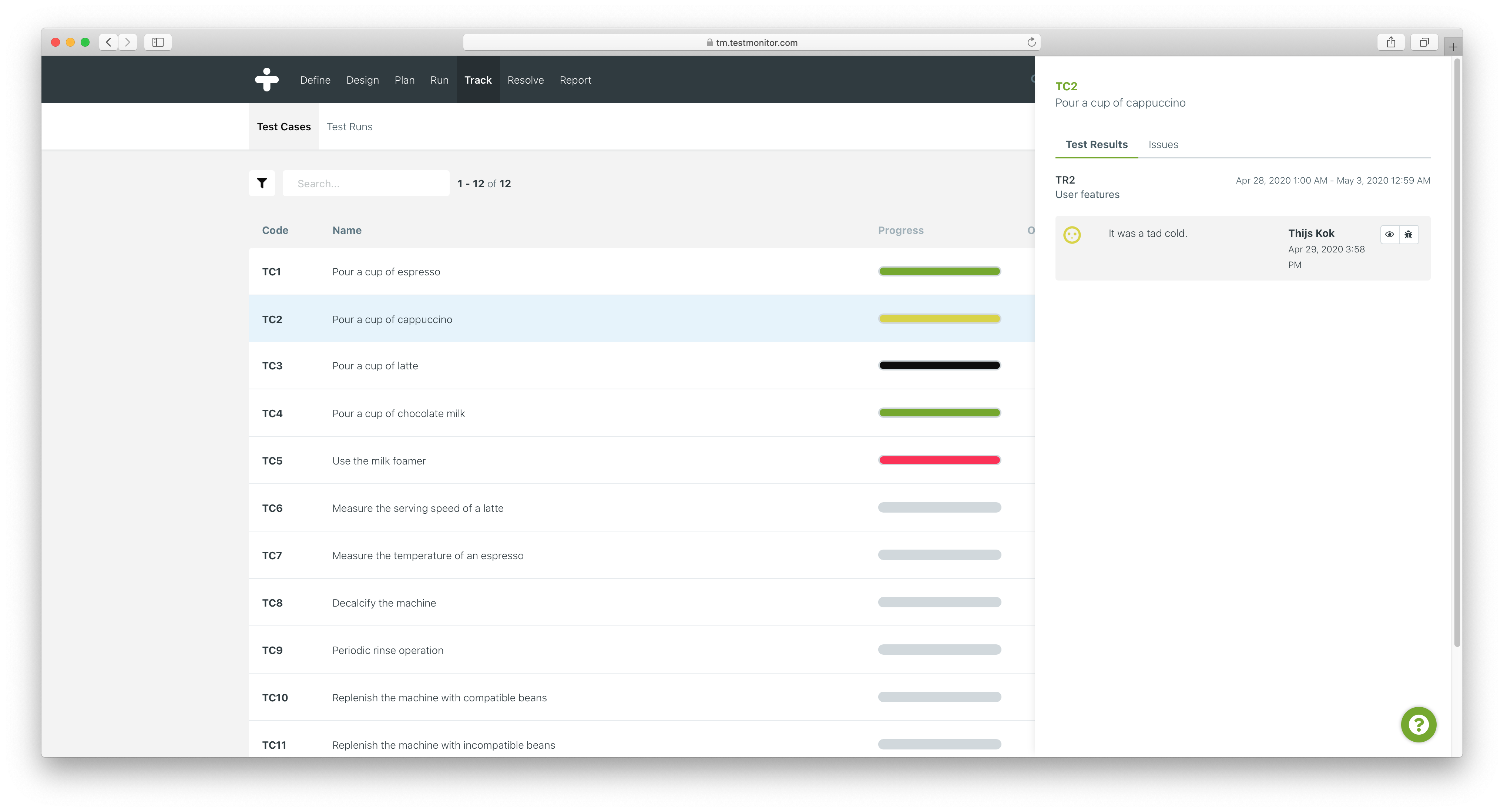 The quick peek system was a welcome feature. Users loved to view test results, make changes, and even create issues right from the sidebar - without ever leaving the overview. However, without initially realizing, the sidebar solution came with some serious downsides over time.
The scrollable sidebar situation
As projects began to grow, the number of test results per test case / run increased. This caused the sidebar to fill up with results in no-time. And even worse: well-annotated test results with longer descriptions and multiple file attachments began to look cramped in the sidebar. Using simulated data, we can illustrate the problem we began to refer to as the "scrollable sidebar situation":
Initially, we decided to "collapse" the test results with a special mark as read feature. After implementation, the number of results didn't cause the sidebar to fill up that quickly anymore, but things still looked cramped. This didn't do the trick.
The sidebar posed another particular problem: we were eager to add new features, but the lack of available space made this quite difficult. For example: we were working on a way to provide test result feedback and needed to add a small button next to each result. Unfortunately, adding another button in the sidebar would make things look cramped even more. So we had to hold off until a solution presented itself.
A lack of space
It is obvious there is a recurring theme with our sidebar solution: whenever we want to scale up, the lack of space forces us to make compromises. When we take a closer look, it becomes clear how much space is actually available. On a standard resolution of 1920x1080, the sidebar is 563 pixels wide (give or take a pixel, depending on the browser). It covers about 29% of the screen. We've marked the sidebar area red in the image below.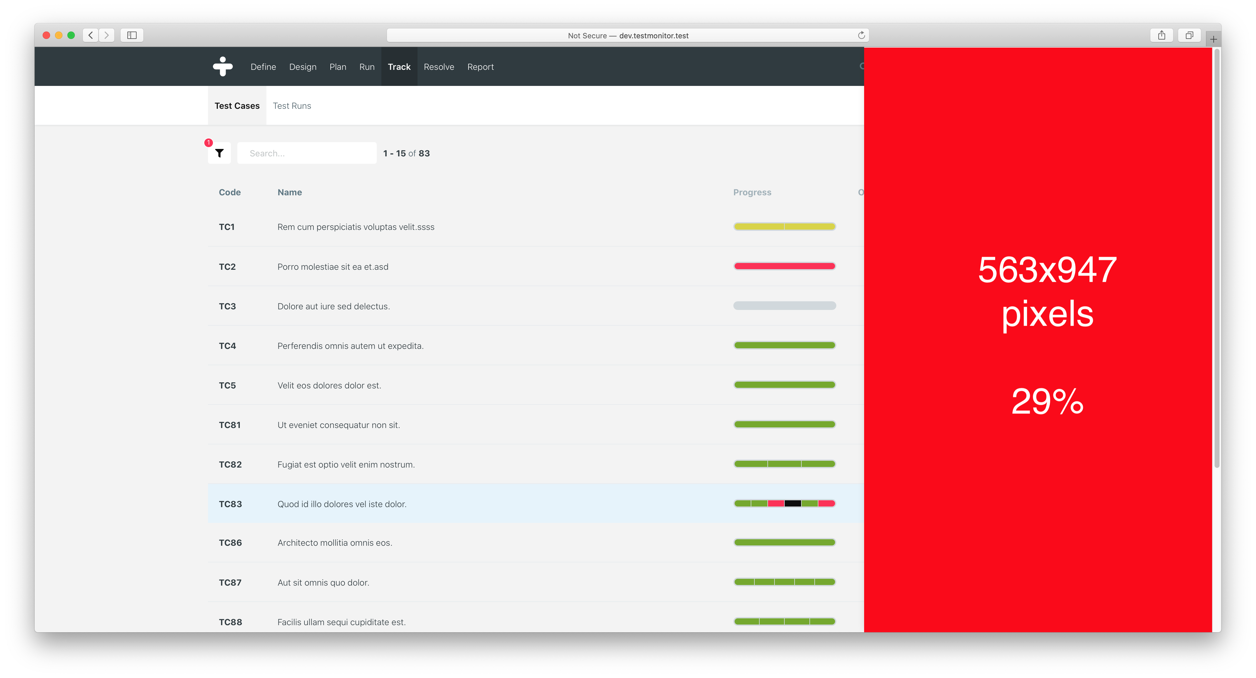
Without the use of scrolling, it's virtually impossible to show each test result without compromising. We toyed around with enlarging the sidebar, but this would only make a marginal difference. So we decided to say goodbye to the sidebar. Track test results needed something better.
Expandables to the rescue!
Before we started working on something new, we started out with a recap of our current issues:
- We faced a lack of space for test results;
- This would leave test results cramped, hard to display, and difficult to read;
- In turn, this also caused the scrollable sidebar situation;
- And to top it off, we were unable to introduce new features.
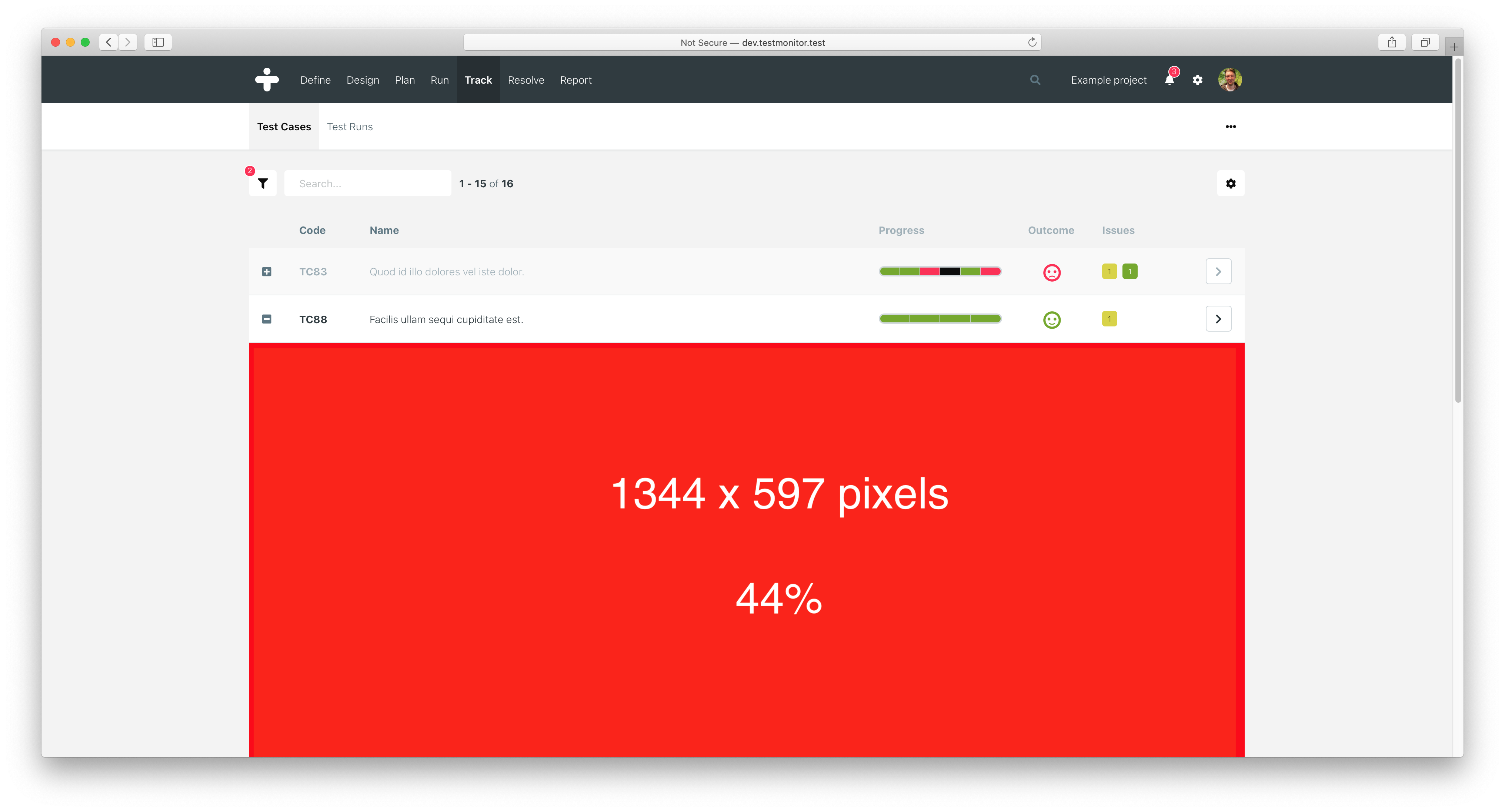
Last year, we had already designed a new UI concept that provided an abundance of available space in tables. It was loosely based on the accordion UI element and seemed like a perfect solution to combat our sidebar issues. We called them row expandables: the ability for a table row to expand itself with a special trigger, revealing context for that specific row. We worked it out and came up with a new test results page using these expandables:
By adopting this design, we saw that every sidebar issue was tackled:
- There was plenty of space for test results;
- We had nice, flowing test results with readable descriptions;
- The ability to use scrolling;
- Ample space to introduce new features (in fact, we already added the test results comments button);
- And as a bonus: because each smiley was properly aligned with the rest, it became much easier to compare test results, per test run and for the entire project.
When we looked at the numbers, the new expandables were able to provide much more screen estate. In an average situation, we measured a 44% availability of screen space, which could go up to beyond 50% when fully expanded.
With any solution, there are bound to be downsides. In this case, there are too. We kind of wished the sidebar would have been sufficient - which would have been better for application consistency. Also, we had to move the issues tab from the sidebar to the test result detail page. That is going to take one extra click. Despite these disadvantages though, we think this new concept will dramatically improve test result tracking.
In the last few months, we have implemented the row expandables for the track test result page. Our tests have been very successful and our TestMonitor experts are really excited.
Go ahead and test it today!
We hope you'll like the new test result screen as much as we do. We've been receiving some positive feedback already! The new design is available as of today in your TestMonitor environment, right under the Track menu. Not part of the TestMonitor family yet? Register for a free trial and try it out for yourself! We're looking forward to your feedback!


